This article will pick up from where our last post on the structure element of user experience left off. This article takes a look at the next step toward a website build following The Elements of User Experience, by Jesse James Garret: the Skeleton Plane.
The Skeleton Plane incorporates the interface design, navigation design, and information design requirements of a website development project. Interface design is the design of elements such as buttons, form fields, and content display functions such as tabs or modal windows. Navigation design is how we present the content pathways and entry points, and information design is how we effectively present topics of content effective to the user. Nobody puts it better than Jesse James Garret himself: if it is the ability to do, it is the interface; if it is the ability to go places, it is navigation; and if it communicates ideas, it is information.
Navigation design is how we design ideal paths to facilitate the user to our goal, and theirs. There are a number of navigation systems that can be employed in various circumstances for different purposes, but the key is to ensure the user knows where they are at all times. Global navigation is the main site navigation and common throughout the site. Local navigation might be a sub-navigation of pages of a particular category set, such as services. It will contain links to other pages in the set. Supplementary navigation might be links to related content from different categories, upsell products, blog tags, and the like. Contextual navigation is navigation that is made available within the content of a page.
Interface design involves making decisions as to how we facilitate action, and what actions take priority. For example, the use of tabs or accordions to conserve space or present options is another example.
Information design is how we present information to make it easy to communicate and understand. This could be visual using graphs, charts, or infographics. It could information based, for example, categories of form questions in a form.
We bring it all together via a combination of a sitemap and a set of wireframes. A sitemap is a hierarchical presentation of the content structure. A wireframe is a sketch, or skeleton, diagram of a page layout showing the placement of content types, interface elements, navigation, and text, image, and video content. We generally find that there will be a few layouts that will be repeated for consistency within content categories.
Picking up from the example from the structure article, we know what content we are going to have on the site, and how it will be grouped and ordered. Now we can design the navigation with the guided strategy of considering the 4 stages of the marketing funnel. Recall that we are using the AIDA (awareness, interest, desire, and action) rather than the more recent funnels which combine desire and action and after care or delight (for after-sales and loyalty-building). We will visit how we can add these in a later post.
The initial function of the home page of a website is to create awareness of who you are as a business and what solutions you provide to market problems. We do, however, have the ability for this, and other pages for that matter, to serve multiple purposes and appeal to the various stages of user intent represented by the funnel. In our example, we can have an introduction to the business and link to the ‘about’ page (awareness). We can have an intro to each of the services or product category and a call to action to each respective service or category page (interest). We can have a testimonial carousel (desire), latest blog posts previews (awareness), and a contact/offer call to action (action).
The site map below shows how we can design navigation that facilitates a user through the website with as short a journey as possible to conversion.

Taking the home page, we can develop a wireframe to incorporate interaction design, navigation design, and information design to fulfil this strategy.
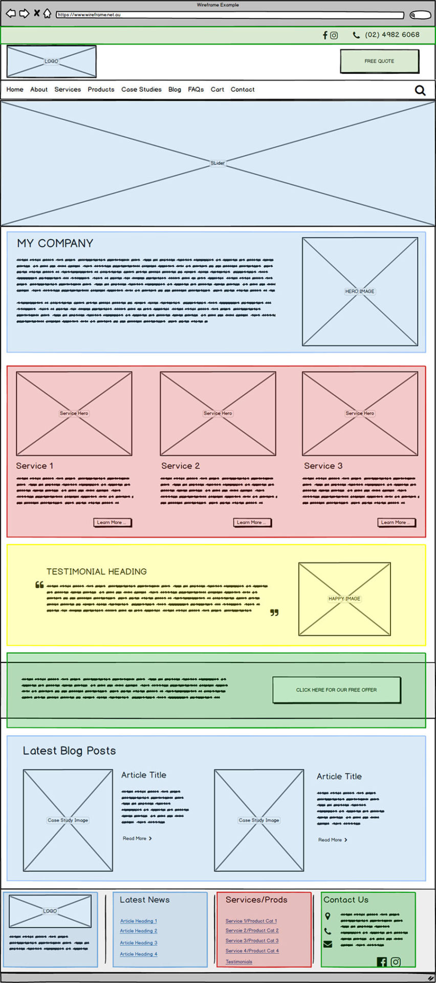
As per the sitemap, the colour shading is to represent content appealing to awareness (blue), interest (red), desire (yellow), and action (green) stages of consumer intent.
How this all becomes a website, is the subject of our next article in this series. If you would like a content review or planning session, contact us.