In our last blog post, I wrote about why website redesigns need strategy before pixels. This week, we got a real-world example that proves the point spectacularly.
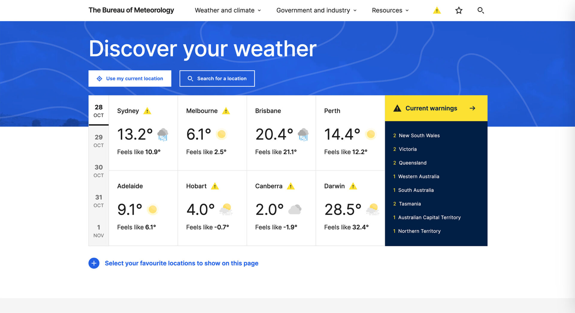
The Australian Bureau of Meteorology just learned an expensive lesson about the difference between designing for users and designing at them. Their $4 million website redesign has ignited a firestorm of criticism from the very people it’s supposed to serve: farmers checking conditions before harvest, fishers reading wind patterns, emergency services coordinating storm responses, and everyday Australians trying to decide if they need an umbrella or an evacuation plan.
The timing couldn’t have been worse. The launch coincided with severe weather events across the nation, exactly when Australians needed their weather service most. And what they found was a sleek, modern interface that looked great in stakeholder presentations but failed spectacularly at its fundamental job: delivering critical information quickly to people in urgent situations.
This isn’t just a cautionary tale about bad timing or poor project management. It’s a strategic case study in what happens when organisations confuse visual modernisation with competitive advancement, and when design ambition overrides strategic user understanding.
The Strategic Flaw: Mistaking Aesthetics for Competitive Advantage
The complaints flooding social media, weather forums, and news outlets reveal a consistent pattern. The new BOM website looks like it was designed to win awards, not to save lives.
Professional users: farmers making time-critical harvest decisions, commercial fishers analysing wind patterns for safe operations, and emergency coordinators managing multi-jurisdictional responses, described fundamental usability barriers that didn’t exist in the previous platform. Features that once required a single click now demanded navigation through multiple interface layers. Information density that supported rapid decision-making gave way to simplified layouts with generous white space, fundamentally misunderstanding how desktop users interact with complex data during high-pressure situations.
One agricultural operator described the experience as “useless,” noting it now takes “twenty different options” to access information previously available at a glance. Marine industry professionals reported difficulty locating wind data essential for operational safety. These aren’t casual users complaining about change, these are professionals whose livelihoods and competitive advantage depend on rapid access to accurate weather intelligence.
The strategic irony is unmistakable: the Bureau invested $4 million to diminish its platform’s value proposition for the users who depend on it most.
When “Modern” Undermines Market Position
There’s a seductive logic that repeatedly ensnares digital transformation initiatives: if it looks contemporary, it must be better. If it mirrors successful apps, users will love it. If we reduce visual clutter, we improve user experience.
Except when the visual “clutter” is actually critical data density. When the “contemporary look” removes the information hierarchy that experts rely on. When the “app-like experience” assumes all users interact with weather data the same way millennials check Instagram.
The BOM redesign demonstrates how easily organisations can confuse aesthetic modernisation with functional improvement. The result is a website that photographs beautifully but performs poorly under the only conditions that actually matter, when Australians need weather information urgently during severe events.
Users accustomed to rapid visual assessments of radar data found themselves confused by altered colour schemes and measurement displays. Storm severity indicators that experienced users had learned to read instantly now required interpretation. During active weather events, these aren’t minor inconveniences—they’re potentially dangerous failures that undermine the platform’s core value proposition.
The Research Gap: When Testing Doesn’t Predict Performance
Here’s where this case study becomes particularly valuable for anyone planning major digital transformations.
BOM management insists they conducted comprehensive research and beta testing that yielded “overwhelmingly positive” feedback. Yet the public response tells a dramatically different story. Social media erupted with criticism. News outlets ran stories about the “epic fail.” Weather forums filled with detailed complaints from users explaining exactly why the new design doesn’t work.
So what happened? How does research show overwhelmingly positive results while the actual user base revolts?
This is the classic trap of validating design decisions with misaligned research methodology. It’s entirely possible to gather positive feedback from users in controlled testing environments while completely missing how the design will perform in real-world crisis conditions.
Did BOM test with farmers trying to make time-sensitive harvest decisions? With emergency services coordinators managing multiple weather threats simultaneously? With elderly Australians who’ve relied on specific visual patterns for decades?
Or did they test with representative samples who appreciated the clean design in calm conditions but couldn’t anticipate how it would fail under pressure?
This disconnect reveals a fundamental truth about strategic digital development: user research is only as valuable as its alignment with actual use contexts. Testing a weather website in benign conditions is like testing emergency equipment in a showroom—you won’t discover the failures until lives depend on performance.
This is exactly why we insist that strategic discovery must happen before design work begins. BOM’s experience proves that you can gather “overwhelmingly positive” feedback while completely missing how your design will perform under the conditions that actually matter.
Real discovery doesn’t just ask “Do you like this design?” It asks “Can you complete your critical tasks under stress conditions?” Those are fundamentally different questions with profoundly different answers.
The Audience Assumption: Optimising for Tomorrow at Today’s Expense
Buried in the criticism is another strategic miscalculation: the apparent assumption that prioritising younger, mobile-native users represented progress.
Multiple commenters noted that the redesign seems optimised for casual mobile users at the expense of professional desktop users who require detailed data analysis. This reflects a broader industry bias that equates “younger users” with “future users” and therefore relegates established user groups to legacy status.
But weather data isn’t social media. The people who depend most heavily on detailed meteorological information—farmers, commercial fishers, emergency services, aviation operators, marine transport—aren’t casually checking conditions on their phones. They’re conducting serious competitive analysis on large screens where information density is an asset, not a liability.
Designing for imagined future users at the expense of current critical users isn’t innovation, it’s strategic abandonment.
The Real Cost of Getting It Wrong
Four million dollars is a substantial investment for any organisation, particularly public services operating under budget scrutiny. That figure has drawn specific attention given the outcome—a website that demonstrably works worse for significant user segments than its predecessor.
But the authentic cost extends far beyond the project budget into cascading competitive consequences:
- Reputational damage: BOM faces sustained public criticism and professional scepticism, eroding trust in an institution that depends on public confidence during emergencies.
- Operational efficiency loss: Thousands of professional users now spend additional time navigating interface complexity to find information they previously accessed instantly—compounding productivity costs across multiple industries.
- Safety implications: Delayed or confused access to weather warnings during severe events creates genuine risk, particularly for agricultural and marine workers where weather intelligence directly impacts safety protocols.
- Opportunity cost: The time, money, and political capital spent on this redesign could have funded improvements that actually enhanced service delivery and competitive positioning.
- Remediation costs: BOM now faces additional expense and effort to address the criticism, either through further redesign work or extensive user education—turning the initial investment into just the down payment on a much larger bill.
This cascading cost structure is typical of web projects that prioritise aesthetic transformation over strategic function.
What the BOM Could Have Done Differently
The fundamental mistake wasn’t modernising the website. It was modernising without strategic clarity about what the website actually needed to accomplish and for whom.
A properly scoped discovery process would have revealed:
- Core user segments and their critical tasks: Farmers needing rapid crop management decisions. Fishers requiring detailed wind and marine forecasts. Emergency services coordinating multi-jurisdictional responses. Casual users checking daily forecasts. Each group has distinct needs and urgency levels that drive platform value.
- Performance requirements under stress conditions: The website isn’t primarily used during calm, sunny days. Its most critical function is delivering information during severe weather events when stakes are highest and user patience is lowest.
- Information hierarchy for expert users: Professional users had developed sophisticated mental models for extracting complex data quickly. Disrupting these patterns required extraordinary justification, not just aesthetic preference.
- Desktop vs. mobile usage patterns: Understanding the context in which different user groups access weather data would have prevented the mistake of applying mobile-first design principles to desktop-dominant use cases.
- Risk tolerance for redesign scope: A phased approach that preserved critical functionality while gradually introducing improvements would have reduced both technical and user acceptance risk.
Armed with these insights, BOM could have pursued modernisation that enhanced rather than disrupted core functionality. They could have improved backend infrastructure and accessibility without fundamentally restructuring the information architecture that expert users depended on for competitive advantage.
The Foundation They Needed: Every item in this list comes from proper strategic discovery: understanding core user segments, defining performance requirements, mapping information hierarchies, and establishing risk tolerance. This is what discovery looks like when done right →
The Strategy Lesson for Every Organisation
The BOM’s experience demonstrates a pattern across industries: organisations routinely confuse modernisation aesthetics with competitive advancement.
New doesn’t automatically mean better. Contemporary design language doesn’t guarantee enhanced user experience. Following industry trends doesn’t ensure alignment with user needs.
What matters is whether the redesigned experience better serves defined user goals in real-world conditions.
This requires beginning with strategic intelligence rather than design preferences. It demands:
- Comprehensive understanding of user segments that generate the highest platform value and their operational requirements
- Clear definition of mission-critical tasks and success metrics for each high-value segment
- Honest assessment of current platform strengths that contribute to competitive advantage
- Recognition that certain user groups have operational needs that conflict with popular design trends
- Commitment to prioritising functional performance over aesthetic alignment with industry fashion
- Testing protocols that simulate real-world operational pressure rather than idealised interaction scenarios
Organisations that execute digital transformations successfully aren’t necessarily those with the largest budgets or most fashionable design partners. They’re organisations that refuse to sacrifice strategic user value for visual modernisation trends.
When Public Service Meets Public Outcry
There’s a particular responsibility when you’re redesigning a digital service that people depend on for safety and livelihood. The BOM website isn’t a retail experience where poor design just costs sales. It’s critical infrastructure where design failures can have real consequences across multiple industries.
This raises the stakes for getting strategy right. When your users include professional operators making time-critical decisions during emergencies, “move fast and break things” isn’t an acceptable philosophy. When your service reaches millions of Australians during severe weather events, you don’t get to treat the launch as a beta test with live operational consequences.
The BOM’s public defence, that user satisfaction will improve as the market adapts to new platform patterns, reveals a troubling strategic assumption: that users should accommodate design decisions rather than have design serve user competitive requirements.
For commercial platforms, this attitude costs market share and revenue growth. For critical public infrastructure, it potentially compromises operational safety and competitive positioning across multiple dependent industries.
The Recovery Path
BOM has indicated they’re making ongoing changes based on community feedback. This is the right response, though it’s a considerably more expensive and politically fraught approach than getting it right initially through proper discovery.
The organisation faces a critical choice: maintain current design direction and expect market adaptation, or acknowledge strategic misalignment and prioritise functional restoration over aesthetic consistency.
The first approach preserves institutional positioning but continues undermining high-value user segments. The second requires public acknowledgment of strategic miscalculation but demonstrates genuine commitment to competitive service delivery over design trend alignment.
For organisations watching this unfold, the lesson is clear: the time to gather and act on user insight is before launch, not after backlash.
Your Redesign Doesn’t Have to Be a Case Study in Failure
Every website redesign involves risk. Technical complexity, competing stakeholder interests, budget constraints, timeline pressure—these challenges are universal.
But the risk of launching something that fundamentally fails your users? That’s entirely avoidable through strategic planning.
Before you commit to visual modernisation, ask:
- Who depends on this digital experience and what do they critically need from it?
- How do different user segments interact with our content under different conditions?
- What functionality currently works well that we risk disrupting?
- How will we validate that design changes enhance rather than impair real-world task completion?
- What’s our rollback plan if user acceptance doesn’t match our projections?
The Australian public’s reaction to the BOM redesign isn’t just about weather websites. It’s about the cost of letting design ambition override strategic user understanding.
Four million dollars bought a modern-looking website that doesn’t serve its users as well as the “outdated” version it replaced. That’s not competitive advancement. That’s an expensive strategic miscalculation disguised as innovation.
Your transformation doesn’t need to become the next strategic cautionary tale.
Strategic digital transformation requires balancing modernisation objectives with competitive user value. When organisations prioritise aesthetic trends over functional excellence, they risk investing substantial resources in diminished market position.
Planning a major redesign? Let’s ensure your strategy serves users first and aesthetics second because the only design trend that never goes out of style is actually working.
📖 Related Reading: Why Website Redesign Needs Strategy Before Pixels. The BOM disaster wasn’t inevitable. Strategic discovery prevents these failures by ensuring design decisions serve user needs rather than aesthetic trends. Learn the strategic approach →