There is a classic quote in marketing from Theodore Levitt that I often use when talking to clients about their website content: “People don’t want to buy a quarter-inch drill, they want a quarter-inch hole”. This means that you customers are not interested in your products or services themselves as much as they are interested in the results it will deliver for them, or the problem or pain they will resolve.
As business owners we are often so deeply ingrained in our products and services that we tend to forget what we are actually offering our market. It is important when it comes to our marketing tools and content that we focus on our users first. The challenge for us in website design is how do we present the quarter-inch hole to the consumer in as short as time as possible.
If there is one book and author that is referred to a lot in business literature, particularly in modern times, it is Daniel Kahneman and his book on human psychology, Thinking Fast and Slow. In this book, Kahneman identifies two “systems” of thinking:
System 1 – thinking is fast, it is intuitive, based on experience, existing knowledge, and most important, emotional.
System 2 – thinking is slow, deliberate, controlled, and based on logic.
We have looked at this before in a past book review on Decoded, in which we made the point that: “On a webpage we have about 3 seconds to register to the autopilot [system 1 thinking] of our users. This means the visual imagery, colours, text, and placement of content cues is critical in compelling the user to make a decision to buy a product or service.”
In order to compel users visiting our website, or social media profiles, that our product or service is the one that will solve their problem, we need to appeal to the fast brain, the system 1 thinking, and then carry the user to your solution where their system 2 thinking might compel a purchase or enquiry decision.
We understand the fast and slow brain – speed is important, content positioning is important, and the content is very important.
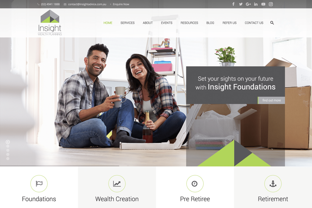
The common “five box” layout is the most effective way of presenting your brand, your solution, and your services in a way that works to the fast brain. This is a common layout in modern websites and works well in mobile devices as the order is maintained but is more vertical to suit the device and scrolling behaviour.
Clients of this local financial planning business, Insight Wealth Planning, are not simply seeking a financial planner, they are seeking security, peace of mind, their first home, freedom from financial burdens, and fulfilling experiences in retirement. Instead of using images of financial planners in front of whiteboards, or graphs, or at desks smiling at the camera, we are showing images of an elated couple celebrating in their first home, business people secure in their planning, people enjoying holiday time for themselves, and people enjoying the joys of retirement.
Under the main feature image area are their 4 services, presented in order of the financial journey: starting out, building and securing wealth, planning for retirement, and retirement itself. This is the life path of financial planning.
Therefore our content strategy for a website is:
- to catch the attention of the fast brain,
- provide a call to action to the solution content page,
- catch the attention of the fast brain again on the content page,
- lead to the detail (for the slow brain), then
- provide a call to action to purchase or enquire.
This is the critical path in a website to conversion.
The key for your business is how to depict your version of the quarter-inch hole mentioned in the start of this article. What images and words will appeal to the fast brain of your users with a presentation of your solution. We consider it our role in planning a website design and development project to help our clients with this in the scoping, planning and UX stages of a project. If you are wanting a website for your business that converts your visitors into sales and enquiries, book a time to come in for a consultation.


