If you’re a business owner with a Facebook Page you may have noticed the most recent change in layout and structure of your page, if you haven’t yet you will very soon with the per user rollout already in place.
So what does this new page structure mean for your presence? Well, quite simply, a whole deal.
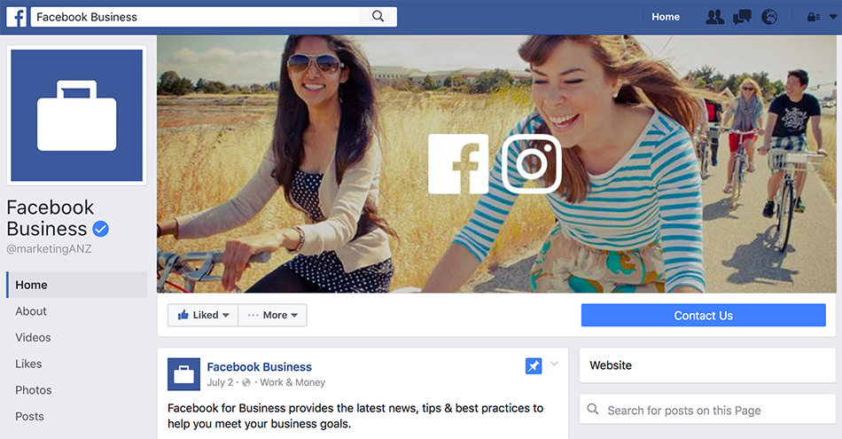
The redesign is a fantastic upgrade that reflects on the layout of a modern website, with the profile picture now sitting flush top left of the page, and the cover image taking main stage with full width and height available without the previous disruption of that profile picture corner. This means more space to highlight your most important message using great imagery or smart call to action images, and less interruption meaning a cleaner, defined look and a direct visual target for your consumer to see on arrival to your page.
One massive upgrade is the call to action button, now bigger and better than ever with fantastic visibility to the bottom right of the cover photo. If you aren’t currently utilising this CTA space, its time to add “Book now”, “Call Now”, “Shop Now” or “Contact us” and give your customers a direct line of action.
Tabs have also moved to the left column, with a sticky setting so links are easily accessible at any point to the user when scrolling through the pages feed.
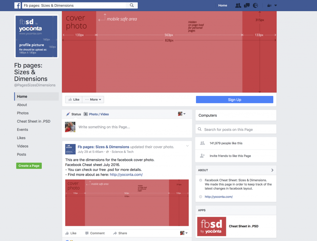
Click the image below to find out Facebook’s new media dimensions.
This design update comes off the back of Facebook’s announcement that they are in works to let small businesses in emerging markets sell to customers for free through Facebook Pages. This may just be the first step to creating an appealing shopfront for many small businesses.
“If a business is seeing value from their page, there is a higher opportunity that they could be an advertiser,”
– Benji Shomair, Product Marketing Director of Facebook Pages.
What else is new for Facebook Pages owners? The 20% text rule on Facebook Ads is officially gone.
Im sure those that have used Facebook advertising before are well aware of the strict no more than 20% text rule that consumed most of your advertising rejections. Well you’ll be glad to hear this is no longer the case, with Facebook giving advertisers more flexibility, instead rating advertisements based on text density which will ultimately affect your ads distribution.
“Your ads will no longer be rejected for having too much text. However, the more text in your image, you can expect less distribution and higher costs. Images will no longer be broken up into a 5×5 grid. Going forward, Facebook breaks down text density into four categories: ok, low, medium, [and] high.”
Our advice; stick to the 20% rule, or as close to as you can to get the best results for your ads. Keep it simple, intriguing and let the ad speak for itself.
Facebook is ever changing, and we’re constantly evolving with it. Come along with us on this ride, contact us to see what we can do to boost your social media presence and activity with a customised social marketing plan to keep you on top of your competitive game.