
A bit of Website Development history. In the early days of web development, and more particularly, my career as a website developer, laying out a website was quite restrictive. Back then, a HTML page, in its most simple form, resembled a Word document in Times New Roman font. However, to develop any sort of visually appealing website, with an effective structure and presentation, required the often innovative use of HTML frames, tables, and transparent spacer GIF files. I thought it might be interesting to take a look back at these times as it is a story of making the most of the technology available.
In HTML terms, a frameset allowed developers to set out a website in independent sections (frames) that were “compiled” together into a webpage. The frameset code was included in to the index file which determined the size, position, and orientation, of each frame and the frame files themselves. Each frame would scroll unless you coded it not to. Locking the scroll allowed for “sticky” headers (ie. Headers that stay at the top of the screen) and/or navigation sidebars while the main content frame could scroll as much as the content required. The alternative to this was to lay out each page of the website in a table in its entirety. The frame method allowed for efficiency in that the header and nav frames were common so changes only needed to be done in one file, instead of all of them.
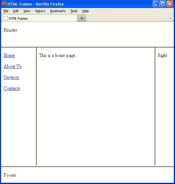
How did this work for a multi-page website? Each frame can be given a “name” and HTML links can “target” this file by name thereby loading the required file in that frame. The most common use of this would be to stick the header and nav as static while the main content frame would be where the various pages of content would load.
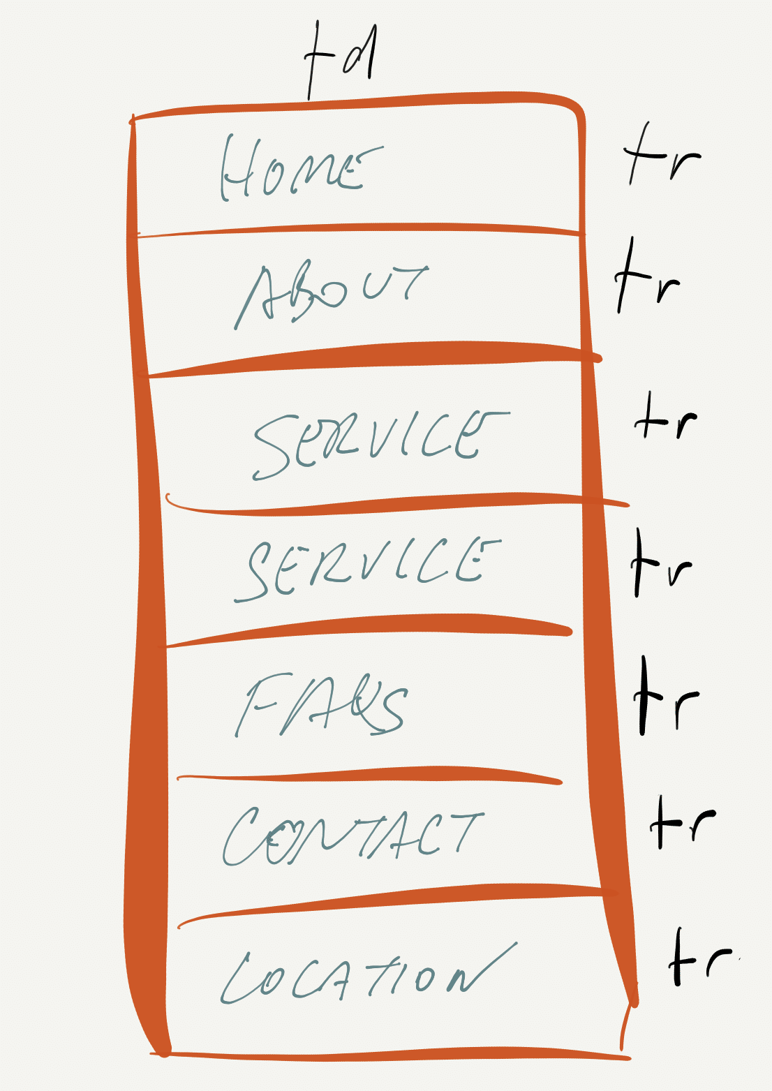
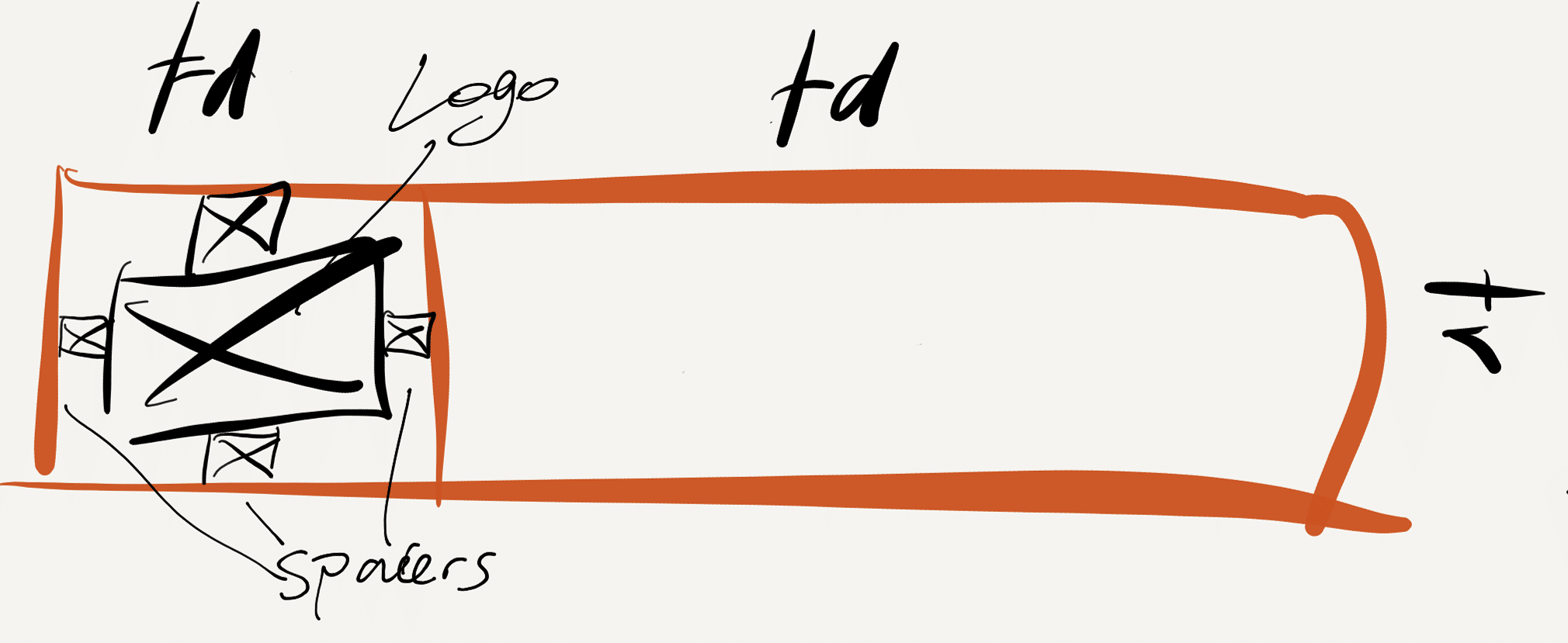
Now, the next challenge was to layout the content required for each frame. In the days before CSS, we did not have the luxury of being able to position divs. This is where we used HTML tables and spacer.gifs. A table is a set of rows, columns, and cells. In order to space a layout horizontally for a header, for example, we would have a row (or rows) with a cell that had a short width for a logo image and one or more longer cells for any additional content or for space.

For those that aren’t as familiar with HTML tags, a <tr> tag stands for table row and <td> stands for table data.
For the navigation, being, in this case, a vertical orientation, the menu items would occupy rows of a single column table, e.g.
The content files would then be laid out with a table set or without depending on how you wanted to present the text and images.
Table data (cells) would have 3 options of both vertical and horizontal alignment: top, bottom, or middle, and left, right, or centre. The challenge of positioning elements more pixel precisely within these parameters was overcome with a transparent pixel gif file. This is an image that is transparent (obviously) which meant it could be “stretched” by HTML width and height settings. You could code this file alongside, above, and/or below the image you want to position within the table cell. You could position it by the pixel by increasing or decreasing the size of the pixels around it to push the element accordingly.
One project I remember well required a circular logo to be positioned across the frameset so it had an overlapping effect compared with the traditional linear placements. This is an example of bringing all the above together. After slicing the image into 3 pieces, the job required placing each slice in adjoining table cells and in adjoining frames and “pushing” them in place with a combination of spacer gifs, cell widths and alignments.
These are very simple descriptions. It was far more challenging when you throw in background images, textures, colours, and more advanced graphic designed elements required for the front-end presentation. Luckily back then we didn’t need to take mobile devices into account!
Yes, it was fiddly and in retrospect, a clumsy way of developing but the result was a “light-weight” website. This preceded by some years the arrival of the smart-phone and therefore responsive development, so as long as your website width was within the most common minimum screen resolution you were usually ok. I pressed a few buttons on the Wayback Machine and found this example of a frame and table site that served the client well for a few years.
I thought I would share this story to demonstrate how we, as developers, are given a set of restrictions and challenged to innovate in the use of the available code, software, and graphic design capability at the time. The coding frameworks have certainly evolved and increased in number. Yet, the core capability and mindset to make the most of what is available is still very much apparent in the work we do today. We take what is available in website development technology as a starting point then we build upon it to achieve a design and user experience that will work for the client.