Connecting to your audience is a skill every brand or business is continually working on, tweaking and re-assessing in this ever-evolving technological world. And depending on your audience, perception of your brand identity can significantly alter content.
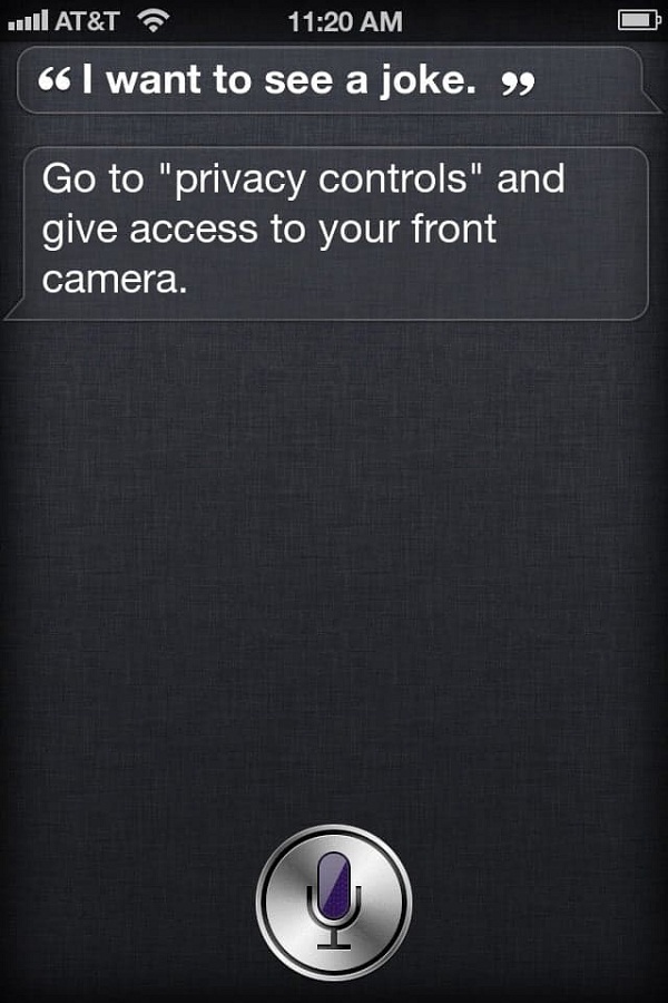
Think about Apple’s use of Siri and the sass she brings when asked a not-so-practical question. It’s brilliant. Of course most of the time Siri is very informational, giving you the best content when you need it. But if you ask a cheeky question you’ll get a cheeky answer. And that is entertainment at it’s lightest.

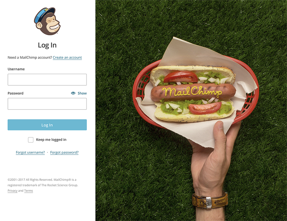
MailChimp also utilises humour across all aspects of their design. Their brand overall is colourful and playful with functionality designed for users at all levels. The humour adds to the brands personality and with light humour evokes fun into the user experience.

Humour can be utilised in your online content and design to build up your brand or business personality, break down some barriers by gaining a users trust, and can most definitely create a competitive advantage by humanising the experience. Humour, of course, will not resonate with all businesses or brands. But if the opportunity is there, and the audience is tailored to correctly, humour can bring out the best in your brand or business.
How do you use humour in design you ask? There are a stack of ways to introduce humour into your online design, but here a few ideas to get your imagination sparked
Self awareness and ability to laugh at ones self
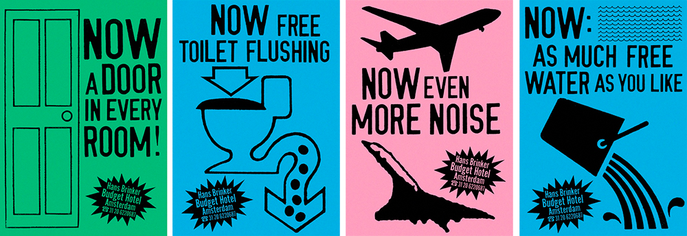
Hans Brinker Hostel in Amsterdam’s website description says it all, and they back up their self admitted mediocre hostel with some quirky designs that’ll leave you in giggles.
Welcome to Hans Brinker, quite honestly not the best but definitely the most memorable hostel in Amsterdam.

The right sort of audience will see this content and design and will pick this hostel purely based on it’s sense of humour, cheekiness and sense of fun. Definitely one way to turn a negative vibe into a positive. #bringonthebadreviews
Clever Language – Punny Funs and what not
Yeah ok…I’m sure you can see what I did there. A very lame attempt at humour, but you smiled, I know it.
Content doesn’t have to always follow the straight-and-narrow predefined route. However If you’re going to add some humour it must be strategic and used frugally, thrown in willy nilly wont see results and can possibly backfire on your initial intention. Keep it focused, and find subtle ways to let them know that you’re laughing and you want them to laugh with you.
Make light of their pain
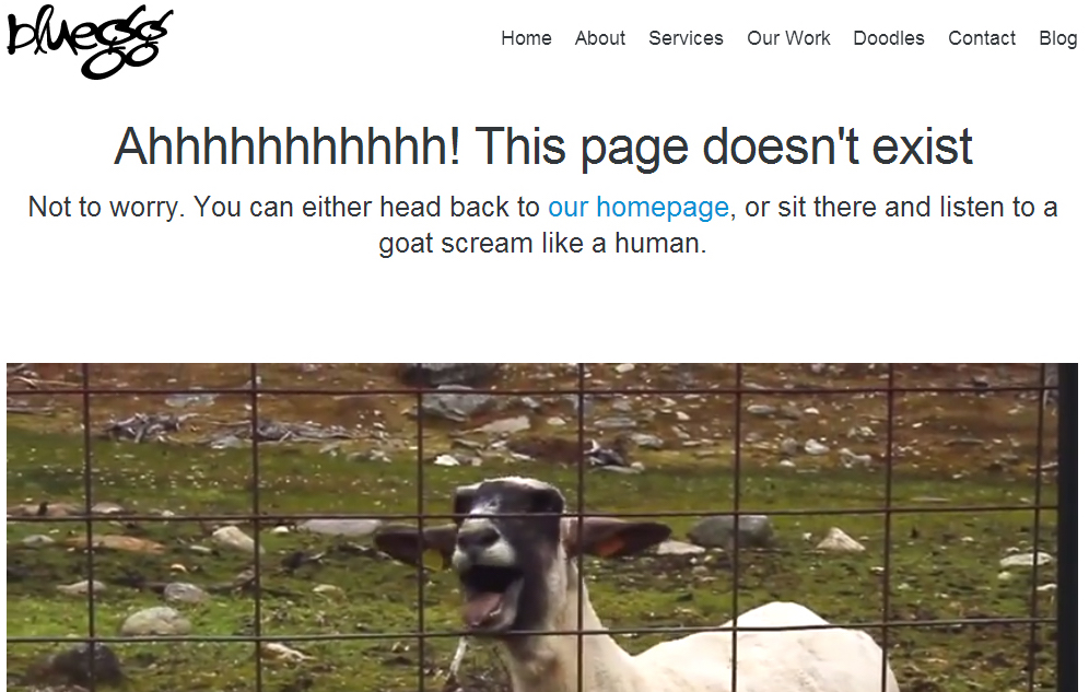
Most websites have a sore spot for users, whether its legals, terms and conditions, long registration forms or checkout processes, and of course the notorious clincher of landing on a page that doesn’t exist anymore (404 page). The user definitely does not like these sore spots, but unfortunately sometimes they just have to be. These areas are a great way to meet and achknowledge the users pain, turn their focus from a negative into a positive (turn that frown upside down) and make common ground.
Like Bluegg’s amazing 404 page, recently re-designed, but back in the days of the Taylor-Swift-Goat-Remix it fit right in with the cultural times.

Humour can give you an edge with users when used appropriately. Ensure any humorous messages you’re going to convey are tested before going live. Be open minded and be willing to take criticism. Because after all, you want the humour to create a positive impact on your business or brand and the relationship you have with your audience, without this its not worth using at all.


