A little while ago I wrote about how we think about appealing to the fast brain, the subconscious, in presenting content on a webpage, or in any visual content. Let’s dive a little deeper in this topic in aspects beyond imagery.
Aside from images what else makes up a website in terms of its visual appeal? We have text body and headings, but we think of these in terms of font pairings, sizing, and calls to action. It is important for us as website designers to understand our client’s audience and to employ that understanding in the way we use fonts, colours, and graphics to help influence their purchasing decision making.
Colours
Although most of the work we do with colour on a website is driven by the client’s brand and style guide, it is important to understand the psychology of colour. Most brands we work with have a colour pairing we can work with, however it is effective to add a third. We will use the brand’s primary colour predominately, and their secondary colour as the pairing, and a highlight or accent colour. Because this accent colour is not necessarily part of the bean we can use a shade that suits the purpose. This purpose is generally a call to action, but could also be a statement of requiring emphasis or to set a mood or feeling (such as security, or safety). Colours do have an effect on our perceptions, here are some examples:
Red – you might think it indicates danger or warning, and it can, but this is because it creates urgency, and stimulates action, so it is effective as a call to action button.
Yellow – can evoke feelings of happiness, brightness, energy, warmth, and fun, but be wary of the shade as a bold primary yellow can also indicate warning (think safety signs).
Green – todays business environment demands that businesses have a concern for the environment, and although it might seem cliche, using green is a way to promote this and satisfy that demand in our users. It also works as a call to action colour when it contrasts greatly with the brand existing colour palette.
Blue – what do Stripe, Paypal, Facebook, American Express, ANZ have in common? The colour blue. It is calming and reliable, it stimulates perceptions of trust and cleanliness.
Black – is associated with strength, authority, and power. It also gives a sense of sophistication and confidence. Care does need to be taken though, when it misses this mark, it can be perceived as dark and negative.
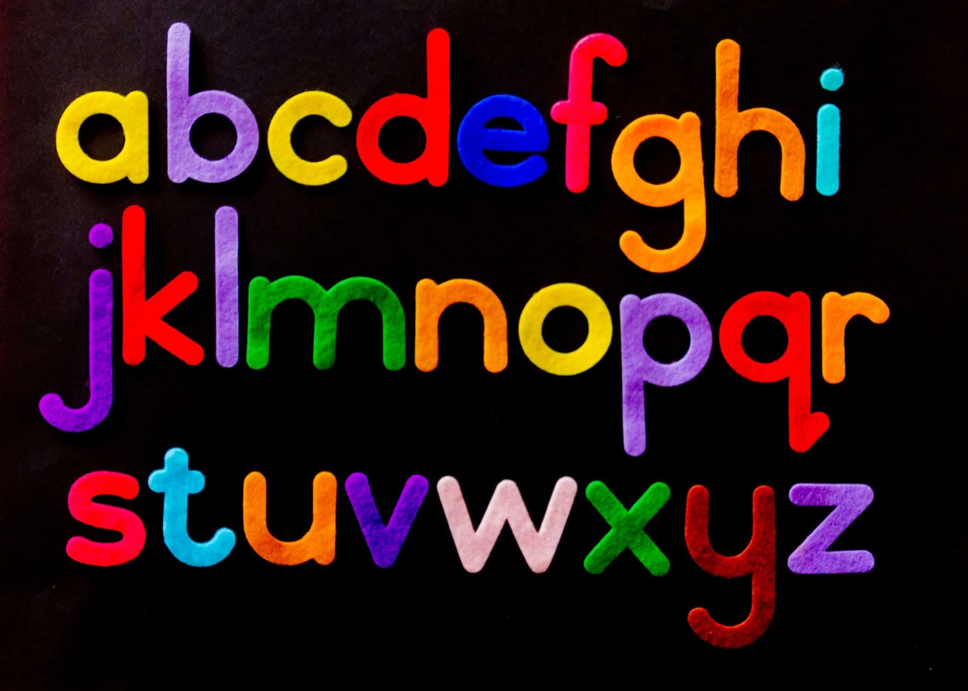
Fonts
Like colours, fonts are also often pre-determined for us by a brand or style guide, however this is less common for us, so we have a bit of freedom to exercise choice. Aside from practical determinants such as legibility and ease on the eyes, we can choose a font pairing that suits the brain or the message we want to convey. Font styles can suit a purpose, here are some examples:
Serif – can convey class, prestige, experience and quality.
Sans Serif – can convey modernity, clarity and security, as well as sleek and technical advancement.
Rounded – often best used when the product or service is organic, such as earthy, natural, healthy products.
Display or Decorative – risky depending on the actual font selected, but can be useful to make bold statements or create a forceful brand impression.
Handwriting – needs to suit the brand but generally brands that are edgy, grungy, or rugged.
Calls to Action
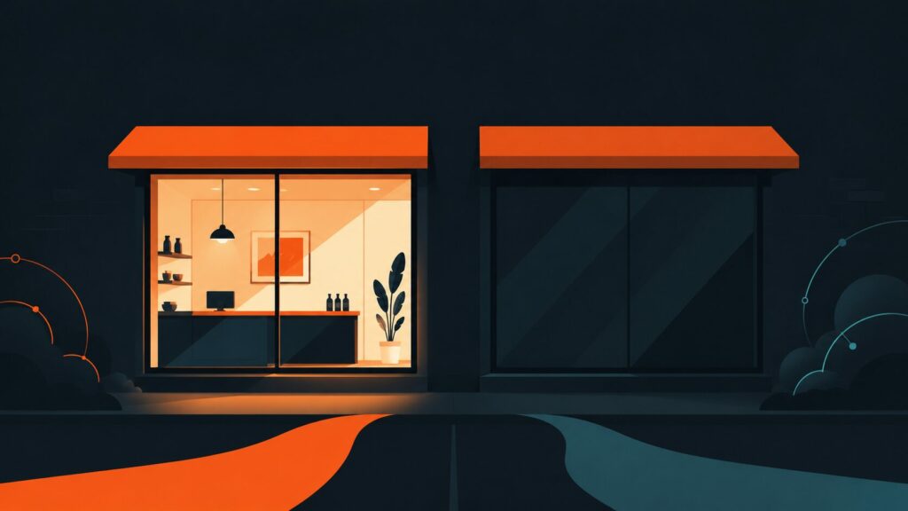
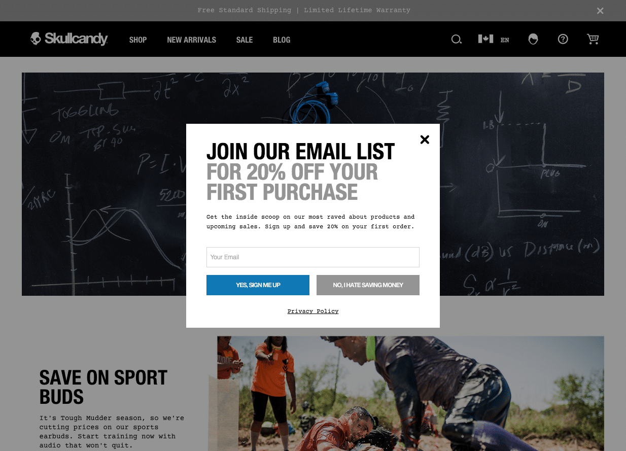
Put simply, calls to action are to attract a user to interact with your site in a way you would like them to. These take form of “buttons” most often. We use a combination of colour and font decisions and the positive/negative reactions we want to promote or avoid in deciding how to present a call to action. For example, if a website requires a strong call to action to sign up to an email list, or to buy, or to register for a quote, we would consider using blue (trust and security) plus sans-serif font (modern and secure) on the positive response (Sign me up!). We can then use a grey for the “close” or “no thanks” option.
The timing of its presentation in the user journey, as well as the post-click feedback, are also important to ensure the user is respected by appropriate responses.
I hope this gives you some understanding of the psychological intention of website design and UX. There is more than meets the eye but nothing gets past the mind.