As part of our growth journey in more recent times we have developed a level of quality in what we produce that has dramatically changed our product. Since we have been producing fantastic websites and providing successful digital marketing strategies we started to think about our own look, and perhaps it was time for an update.
Given our own graphic design expertise, the easiest thing to do would have been to approach a rebranding exercise ourselves. However, we are not brand experts, and we wanted to lift to another level, and this required bringing in expertise in brand development. Enter our friends Ronnoco. We work with Raz and Jodi from Ronnoco on a number of projects past and present, and know each other fairly well. I wanted to be arm’s length from the actual design but participate in the visioning process, therefore we wanted to engage people who know us, where we came from, and where we want to go.
Being a fan of Simon Sinek and his Start With Why framework, I was wrapped that the Ronnoco Brand Discovery process was a look at the business self, and our why. Why we do what we do as a business needed to be drawn from our values, we then worked on how we worked with our clients and internally, and what we actually do in terms of our product.
We see ourselves as approachable, friendly, supportive, progressive, and committed to our work and the success of our clients. It is aspirational for us to become ongoing partners in the business success of our clients by being the friendly, supportive, and committed resource on hand to drive them to success via website development and digital marketing. This is our value statement: We partner with businesses to help achieve their goals.
We found we look to the future and bring it to the present for our clients. We found that we provided solutions for them by providing solutions for their customers. We found that we are constantly standing on the edge of technique to ensure competitive advantage, and most importantly, we found that we enjoy the people we work with and for and value those relationships.
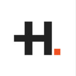
Ronnoco presented us with 3 concepts to represent our values and the choice was instantly unanimous. The H contains a + which evokes the partnership between us + our clients. The change from the navy blue to the charcoal is to create a stronger presence, as we are becoming in our industry. The bolder orange is a touch back to the previous logo but is also much stronger and committed. The dot is a pixel, which is what we work with. We turn pixels into profit for our clients.
 We are very excited about the new brand. We will be embedding our values into our processes and output in a renewed commitment to our clients past and present. Look out for our new look, the +H. The H is us and the + is you.
A huge thanks to my team (at the time, there are two more since), Jes and Carolyn, and your active and fearless participation in the process. Thanks to Raz, Jodi, and Andrew from Ronnoco who have treated us with care, the best intentions, an awesome and easy process, and a fantastic result.
So that is the story of the new brand … so far.